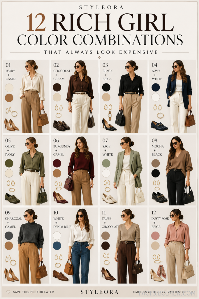
Ever scrolled past a street style photo and wondered how some people just look expensive? It’s rarely about the price tag. It’s about color. The right pairing can make a $30 dress look like it belongs in a designer boutique, while the wrong one can make even luxury pieces fall flat. That’s why we’ve rounded up 16 color combinations that consistently deliver that polished, high-end vibe. From soft pastels to rich jewel tones, these pairings are easy to recreate with pieces you probably already own. Ready to upgrade your outfit game? Let’s dive in.
Table of Contents(Click to Toggle)
Why Color Combinations Matter for an Expensive Look
Color is the first thing people notice about your outfit, even before they register the cut or fabric. A well-chosen palette can elevate simple pieces into something that looks curated and intentional. Think about it: a plain white tee and jeans can look basic, but swap the jeans for a pair of tailored trousers in a complementary shade, and suddenly the whole outfit feels more refined. The key is contrast and harmony—pairing shades that flatter each other without clashing. Expensive-looking combinations often involve a neutral base with a soft accent, or a deep, rich tone balanced by a lighter one. In this guide, we’ve curated 16 combinations that consistently achieve that luxe effect. Each pairing comes with styling tips and accessory suggestions to help you pull it off effortlessly.
16 Expensive-Looking Color Combinations
1. Blush Pink & Ivory : The Ultimate Soft & Sophisticated Pair
What it is: A delicate balance of warm blush pink and creamy ivory that feels romantic yet refined.
Category: Soft Pastels
Why it stands out:
- Creates a gentle, feminine aesthetic that’s perfect for daytime events.
- The low contrast between the two shades makes it look effortlessly expensive.
- Works well in both casual and formal settings, from brunch to a garden wedding.
Best for: Spring and summer outfits, especially flowy dresses and lightweight knits.
2. Lavender & Chocolate : A Rich, Unexpected Contrast
What it is: Soft lavender paired with deep chocolate brown for a striking yet harmonious look.
Category: Pastel + Neutral
Why it stands out:
- The earthy brown grounds the airy lavender, making it suitable for autumn.
- Adds depth without being too dark or heavy.
- Looks particularly luxe in satin or silk fabrics.
Best for: Transitional weather, office wear, and evening dinners.
3. Sage Green & Black : Modern & Minimalist
What it is: A muted green paired with classic black for a sleek, contemporary vibe.
Category: Earthy + Neutral
Why it stands out:
- The black adds sophistication, while sage keeps it from feeling too severe.
- Perfect for creating a capsule wardrobe with mix-and-match pieces.
- Works well with gold accessories for an extra touch of elegance.
Best for: Everyday chic, from work to weekend.
4. Butter Yellow & Navy : Sunny Meets Classic
What it is: A cheerful yellow softened by deep navy blue.
Category: Pastel + Dark Neutral
Why it stands out:
- The navy anchors the brightness of the yellow, making it wearable for more occasions.
- Evokes a nautical, preppy aesthetic that never goes out of style.
- Great for adding a pop of color to a neutral wardrobe.
Best for: Spring outfits, casual Fridays, and seaside getaways.
5. Baby Blue & White : Crisp & Clean
What it is: A light, airy blue paired with pure white for a fresh, clean look.
Category: Pastel + Neutral
Why it stands out:
- Instantly brightens the complexion and feels refreshing.
- Perfect for hot weather and minimalist aesthetics.
- Can be dressed up with metallic accessories or kept casual with sneakers.
Best for: Summer days, resort wear, and casual outings.
6. Peach & Olive : Earthy & Warm
What it is: A soft peachy tone combined with muted olive green.
Category: Earth Tones
Why it stands out:
- The combination feels natural and grounded, ideal for autumn.
- Both colors are flattering on a wide range of skin tones.
- Adds a subtle warmth without being overly bright.
Best for: Fall fashion, outdoor events, and casual chic looks.
7. Mint & Burgundy : Fresh Meets Deep
What it is: Cool mint green paired with rich burgundy.
Category: Pastel + Jewel Tone
Why it stands out:
- The contrast between light and dark creates a visually striking outfit.
- Burgundy adds a touch of luxury, while mint keeps it modern.
- Works beautifully in velvet or satin fabrics.
Best for: Holiday parties, date nights, and winter styling.
8. Lilac & Sage : Soft & Serene
What it is: Two muted pastels—lilac and sage—combined for a calming effect.
Category: Pastel Duo
Why it stands out:
- Creates a gentle, almost ethereal look that feels very current.
- Perfect for those who prefer low-contrast, tonal outfits.
- Ideal for spring and can be worn head-to-toe for a monochromatic feel.
Best for: Daytime events, brunch, and casual wear.
9. Coral & Mocha : Vibrant & Grounded
What it is: Bright coral paired with soft mocha brown.
Category: Warm Tones
Why it stands out:
- The mocha tempers the vibrancy of coral, making it more wearable.
- Adds a tropical yet sophisticated feel.
- Great for those who want to experiment with color without going overboard.
Best for: Summer evenings, vacations, and social events.
10. Sky Blue & Charcoal : Cool & Contemporary
What it is: Light sky blue paired with dark charcoal grey.
Category: Cool Neutrals
Why it stands out:
- The charcoal adds a modern edge to the soft blue.
- Creates a professional yet stylish look suitable for work.
- Can be easily accessorized with silver or white gold jewelry.
Best for: Office wear, business casual, and urban settings.
11. Rose & White : Classic Romance
What it is: A soft rose pink paired with crisp white.
Category: Pastel + Neutral
Why it stands out:
- Timeless and elegant, reminiscent of vintage glamour.
- White makes the pink pop without being overwhelming.
- Perfect for creating a fresh, clean aesthetic.
Best for: Spring and summer, weddings, and romantic occasions.
12. Lemon & Taupe : Zesty & Neutral
What it is: Bright lemon yellow balanced by muted taupe.
Category: Pastel + Neutral
Why it stands out:
- Taupe keeps the yellow from feeling too loud, making it sophisticated.
- Adds a subtle pop of color to a neutral outfit.
- Works well in both casual and smart-casual settings.
Best for: Daytime looks, brunch, and city strolls.
13. Dusty Rose & Camel : Understated Luxury
What it is: Muted dusty rose paired with warm camel.
Category: Earthy + Pastel
Why it stands out:
- The combination exudes quiet luxury and sophistication.
- Both colors are versatile and flattering on many skin tones.
- Ideal for autumn and winter layering.
Best for: Fall fashion, outerwear, and elegant everyday wear.
14. Powder Blue & Denim Blue : Monochromatic Magic
What it is: Two shades of blue—light powder and medium denim—layered together.
Category: Monochromatic
Why it stands out:
- Creates a cohesive, elongated silhouette.
- Easy to style and always looks put-together.
- Denim adds texture, making the outfit interesting.
Best for: Casual outings, travel, and weekend wear.
15. Mauve & Chocolate : Deep & Romantic
What it is: Dusty mauve paired with rich chocolate brown.
Category: Earth Tones
Why it stands out:
- The deep tones create a luxurious, cozy feel.
- Perfect for evening events and colder months.
- Looks especially elegant in velvet or cashmere.
Best for: Winter styling, date nights, and formal events.
16. Seafoam & Beige : Soft & Organic
What it is: A gentle seafoam green paired with warm beige.
Category: Pastel + Neutral
Why it stands out:
- Evokes a calm, beachy vibe that’s perfect for relaxed settings.
- Beige adds warmth, making the cool green more approachable.
- Ideal for a minimalist, organic aesthetic.
Best for: Summer, casual events, and everyday wear.
Bonus Mentions
Cream & Caramel : Sweet & Sophisticated
What it is: Soft cream paired with rich caramel for a deliciously warm combo.
Category: Neutral Duo
Why it stands out:
- Creates a cozy, inviting look that’s perfect for autumn.
- Both shades are versatile and easy to mix with other neutrals.
Best for: Fall outfits, knitwear, and casual chic.
Periwinkle & Grey : Cool & Collected
What it is: A soft periwinkle blue paired with medium grey.
Category: Cool Tones
Why it stands out:
- The grey adds a modern, urban feel to the delicate periwinkle.
- Great for those who love blue but want something different from navy.
Best for: Office wear, city breaks, and transitional weather.
Apricot & Slate : Warm Meets Cool
What it is: Soft apricot paired with cool slate grey.
Category: Contrasting Neutrals
Why it stands out:
- The contrast between warm and cool tones creates visual interest.
- Slate keeps the apricot from being too sweet.
Best for: Modern, edgy looks and evening events.
Mint & White : Fresh & Crisp
What it is: A bright mint green paired with pure white.
Category: Pastel + Neutral
Why it stands out:
- Ultra-refreshing and perfect for hot summer days.
- White enhances the brightness of the mint.
Best for: Summer, resort wear, and casual outings.
Plum & Grey : Moody & Elegant
What it is: Deep plum purple paired with soft grey.
Category: Jewel + Neutral
Why it stands out:
- Grey softens the intensity of plum, making it wearable for daytime.
- Adds a touch of drama without being overpowering.
Best for: Fall and winter, office parties, and sophisticated events.
The Secret to Always Looking Expensive
Mastering color combinations is one of the simplest ways to elevate your style without spending a fortune. The 16 pairings above prove that looking expensive is less about the price tag and more about the palette. Whether you gravitate toward soft pastels or rich jewel tones, there’s a combination here for every mood and occasion. Remember, the key is to balance contrast and harmony—and don’t be afraid to experiment. Start with one new pairing this week and see how it transforms your outfit. Which color combination are you most excited to try? Share your favorite in the comments below—we’d love to hear your stylish finds!