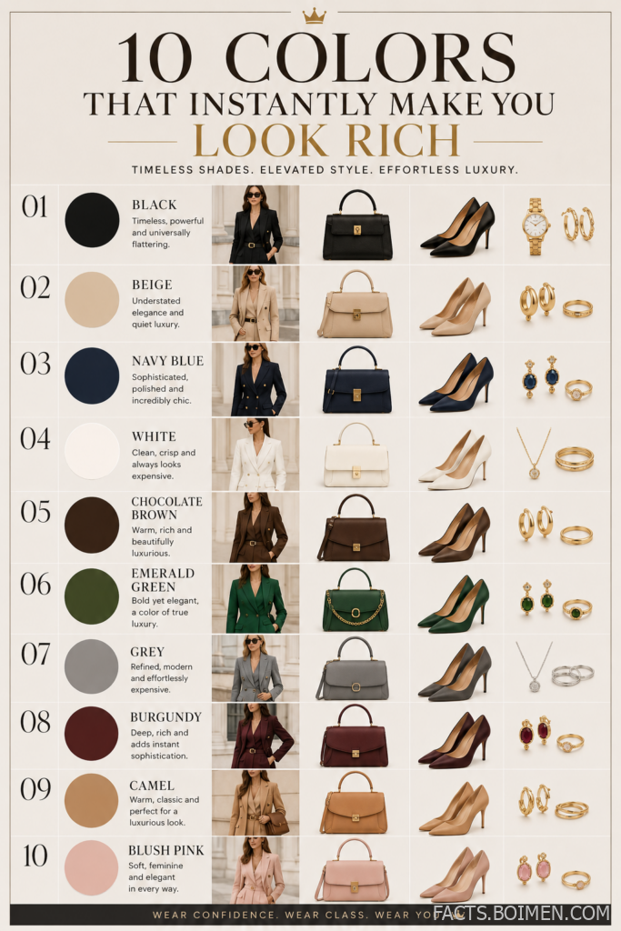
You have probably noticed it: some people walk into a room in a plain sweater and instantly read as expensive. No logos, no flash, no obvious price tags. The secret is rarely the clothing itself. It is the color. Quiet luxury and old money style are built on a tight, disciplined palette of shades that photograph well, pair effortlessly, and carry a psychological weight that bright colors never quite match. Below are the ten colors that do the heaviest lifting in a premium wardrobe, plus exactly how to wear each one so the effect lands.
Table of Contents(Click to Toggle)
Why Color Does More for Your Look Than Price Tags
Quiet luxury is not a shopping budget, it is a visual language. The style relies on restraint, texture, and a palette that stays within a narrow family of muted, earthy, and deep tones. When every piece you own lives in that family, outfits combine themselves and the eye reads the result as intentional. That is why a $40 camel knit can look more expensive than a $400 neon jacket: the color signals calm, maturity, and control, while loud shades signal novelty that dates fast. The ten colors below are the ones stylists return to again and again because they flatter nearly every skin tone, hold up in photos, and survive trend cycles. Think of this as a capsule wardrobe color chart, not a shopping list.
The 10 Rich-Looking Colors
1. Camel : The single most expensive-looking neutral
What it is: A warm, sandy brown that sits between beige and tan, made famous by Italian outerwear houses.
Category: Warm neutral
Why it stands out:
- It reads as heritage and craftsmanship, especially in wool and cashmere
- It warms up black and grey outfits instantly
- It photographs beautifully against brick, stone, and greenery
Best for: Coats, trench styles, and knitwear worn over dark denim.
2. Cream and Ivory : Softer than white, richer than grey
What it is: Off-white tones with a hint of warmth, from buttermilk to oyster.
Category: Light neutral
Why it stands out:
- Pure white can look stark; cream looks considered and soft
- It creates that crisp “resort wardrobe” contrast against tan skin or dark hair
- Works as a full monochrome outfit without looking like a uniform
Best for: Silk shirts, wide-leg trousers, and lightweight knit polos.
3. Navy : The universal power color
What it is: A deep, slightly desaturated blue that borders on black in low light.
Category: Deep cool neutral
Why it stands out:
- It is the classic tailoring color and flatters almost every complexion
- It pairs with camel, cream, grey, and brown without effort
- It hides wrinkles and fabric flaws better than black
Best for: Blazers, trousers, and a single well-cut coat.
4. Charcoal Grey : The quiet alternative to black
What it is: A dark, cool grey with a soft matte finish.
Category: Deep cool neutral
Why it stands out:
- It is less harsh than black and looks richer in daylight
- Layering charcoal over black creates subtle depth
- It reads as modern minimalism rather than office formality
Best for: Knitwear, tailored trousers, and structured coats.
5. Chocolate Brown : Warm, grounded, and quietly luxurious
What it is: A deep cocoa brown, richer and darker than camel.
Category: Warm deep neutral
Why it stands out:
- It is the defining color of leather goods and looks premium in suede
- It pairs beautifully with cream, camel, and olive
- It flatters warmer skin tones where black can look flat
Best for: Bags, boots, belts, and mid-weight knitwear.
6. Stone and Greige : The modern neutral that never clashes
What it is: A blend of grey and beige, cool and warm at once.
Category: Balanced neutral
Why it stands out:
- It is the easiest color to build a monochrome outfit around
- It looks expensive in linen and wool because the texture does the talking
- It bridges warm and cool pieces in one wardrobe
Best for: Suiting, relaxed trousers, and long-sleeve tees.
7. Olive : Earthy without being loud
What it is: A muted, grey-tinged green inspired by military and field jackets.
Category: Muted earth tone
Why it stands out:
- It adds color to a neutral wardrobe without breaking the calm
- It looks especially rich in cotton twill and wool
- It pairs with cream, camel, and charcoal effortlessly
Best for: Utility jackets, chinos, and casual knitwear.
8. Burgundy : The old money accent
What it is: A deep wine red with brown undertones.
Category: Deep jewel accent
Why it stands out:
- It is the classic color of loafers, ties, and heritage knitwear
- It adds warmth and depth to grey and navy outfits
- It looks expensive in polished leather and fine gauge wool
Best for: Accessories, knit polos, and a single statement knit.
9. Forest Green : Countryside heritage in a color
What it is: A deep, slightly blue-leaning green.
Category: Deep earth tone
Why it stands out:
- It carries an outdoor, heritage feel that reads as timeless
- It pairs naturally with camel, brown, and cream
- It looks especially premium in waxed cotton and wool
Best for: Outerwear, scarves, and structured bags.
10. Black : The original quiet luxury staple
What it is: The darkest neutral, best in matte and textured finishes.
Category: Core neutral
Why it stands out:
- It is the fastest route to a sleek, unified silhouette
- It looks richest when mixed with cream or camel rather than worn head to toe
- It makes texture, like satin or cashmere, the focal point
Best for: Evening looks, tailored pieces, and leather accessories.
Bonus Mentions
Powder Blue : A soft, refined alternative to bright blue
A pale, greyish blue that reads calm and polished. It works best in shirting and lightweight knitwear, and it pairs beautifully with cream and stone. Keep the shade muted rather than saturated.
Warm Taupe : The underrated middle ground
Sitting between beige and grey, taupe is forgiving on most skin tones and looks especially rich in suede and wool. It is a smart substitute when camel feels too warm for your coloring.
Oatmeal : Cream’s cozier cousin
A textured light neutral with a hint of brown. It is ideal for knitwear and loungewear where you want softness rather than crispness, and it layers perfectly under camel and olive.
Soft Rust : A warm accent used sparingly
A muted burnt orange that adds life to a neutral wardrobe. Use it in one piece at a time, such as a knit or scarf, so it stays an accent rather than taking over the outfit.
Building a Palette That Never Looks Cheap
The real takeaway is not that you need ten colors. It is that a small, disciplined palette beats a large, scattered one every time. Start with three: a warm neutral like camel, a deep neutral like navy or charcoal, and a light neutral like cream. Build outfits from those three and add one accent such as burgundy or olive when you want variety. Pay attention to fabric as much as shade, because matte wool, brushed cotton, and fine knits make muted colors look far more expensive than shiny synthetics do. Keep your metals consistent, keep your prints minimal, and let the palette do the work. Quiet luxury is ultimately about looking settled in what you wear, and color is the fastest way to get there.
Which of these colors already lives in your wardrobe, and which one are you tempted to add next? Share your favorite combination in the comments.