When text refuses to stay still, reading stops being automatic. For many people with visual dyslexia and related visual stress, letters do not simply sit on a line — they blur, halo, swirl, or slide. The names below come straight from how readers describe the experience, and understanding them is the first step toward finding the right reading tools, overlays, and typography settings.
Table of Contents(Click to Toggle)
- Why These Visual Effects Matter
- The 16 Blurry Effect Types
- 1. Blur Effect
- 2. Halo Effect
- 3. Shaky Effect
- 4. Swirl Effect
- 5. Rivers Effect
- 6. Seesaw Effect
- 7. Washout Effect
- 8. Overlapping Writing
- 9. Double Vision Effect
- 10. Fading Effect
- 11. Sparkle Effect
- 12. Tunnel Effect
- 13. Jelly Effect
- 14. Shadow Effect
- 15. Bouncing Line Effect
- 16. Melt Effect
- Bonus Mentions
- The Internet’s Best-Kept Secrets (So Far)
Why These Visual Effects Matter
Visual dyslexia is not one single condition — it is an umbrella term people use for the way text can distort, blur, or move on the page. Researchers often group these experiences under “visual stress” or “Meares-Irlen syndrome,” and the symptoms can change depending on font size, background colour, line spacing, and lighting. Naming the effect is surprisingly powerful: once a reader can say “my words go shaky at the end of a line,” they can search for a specific fix, ask a specialist a sharper question, or adjust a reading app with intent instead of guesswork.
The sixteen effects below are the most commonly described patterns. Each entry explains what the effect looks like, why it happens, and which tools or adjustments tend to help. None of this is a diagnosis — it is a vocabulary, and vocabulary is where better reading comfort begins.
1. Microsoft Edge Immersive Reader : The blur effect, softened
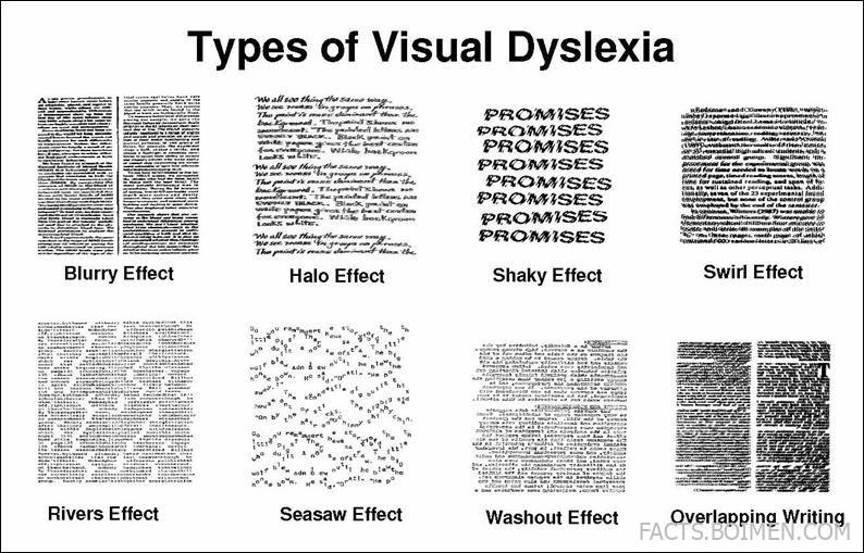
What it is: The blur effect is the most reported visual dyslexia symptom — letters lose their sharp edges and the page looks like a photograph taken slightly out of focus.
Category: Reading comfort / text clarity
Why it stands out: Microsoft Edge’s Immersive Reader strips away sidebars, ads, and clutter, then lets you widen letter spacing, increase line height, and switch to a calm background. The blur does not vanish for everyone, but removing visual noise measurably reduces how hard the eyes have to work.
Best for: Anyone who finds dense web articles turn fuzzy within a few paragraphs.
2. Texthelp Read&Write : Taming the halo effect
What it is: The halo effect describes a glowing outline or ghost edge around each letter, as if the text has been over-sharpened.
Category: Assistive reading software
Why it stands out: Read&Write offers screen masking, colour overlays, and a reading ruler that highlights one line at a time, which reduces the contrast between letter and background that often triggers haloing. It works across browsers, PDFs, and Word documents.
Best for: Students and office workers who read long documents and need consistent settings everywhere.
3. Iris : Calming the shaky effect
What it is: The shaky effect makes words tremble or vibrate in place, especially at the edges of your vision.
Category: Screen colour and contrast control
Why it stands out: Iris adjusts colour temperature, brightness, and contrast at the operating-system level, and its text mode reduces the harsh black-on-white contrast that many readers say makes letters jitter. Because it sits below your apps, it applies to everything on screen.
Best for: Readers who notice shakiness worsening during long screen sessions or under fluorescent lighting.
4. Libby by OverDrive : Reducing the swirl effect
What it is: The swirl effect bends lines of text into gentle curves, as though the paragraph is being stirred.
Category: Ebook reading apps
Why it stands out: Libby gives you full control over font, size, line spacing, and background colour in borrowed library ebooks. Narrow columns and generous spacing keep the eye from losing its place, which is exactly what swirl-prone readers need.
Best for: Readers who want adjustable, distraction-free ebooks without buying every title.
5. Seeing AI : Reading through rivers
What it is: The rivers effect is when the white gaps between words line up vertically, creating pale “rivers” that run down the page and pull attention away from the words.
Category: Mobile accessibility app
Why it stands out: Seeing AI can read short text aloud instantly, so rivers stop mattering because you are listening instead of scanning. It also handles handwriting, product labels, and documents, making it useful well beyond books.
Best for: Quick reading tasks on the go, such as labels, letters, and printed handouts.
6. NaturalReader : Stopping the seesaw effect
What it is: The seesaw effect makes the start and end of a line appear to rise and fall, so the sentence looks tilted rather than level.
Category: Text-to-speech
Why it stands out: NaturalReader reads documents, web pages, and PDFs aloud with synchronised highlighting, so your eyes can follow the audio instead of fighting a tilting line. You can slow the pace and choose voices that suit long listening sessions.
Best for: Readers who tire quickly and want to switch between reading and listening mid-page.
7. Irlen Institute : Addressing the washout effect
What it is: The washout effect is when contrast collapses — black text on white paper fades to pale grey, especially in bright rooms.
Category: Coloured overlay and assessment resources
Why it stands out: The Irlen approach uses individually selected coloured overlays and filters to restore comfortable contrast. The site explains the screening process and helps you find a trained assessor rather than guessing at colours.
Best for: Readers who have tried generic coloured overlays and want a more personalised route.
8. Beeline Reader : Untangling overlapping writing
What it is: Overlapping writing is when lines appear to merge, or letters from one row bleed into the row above or below.
Category: Reading gradient tool
Why it stands out: Beeline applies a colour gradient across each line, from a darker start to a lighter finish, which gives the eye a clear anchor for where each line begins. It is a small change with a surprisingly large effect on line tracking.
Best for: Readers who lose their place and re-read the same line repeatedly.
9. Open Book Publishers : Managing double vision on screen
What it is: The double vision effect makes each word appear twice, slightly offset, like a misprinted page.
Category: Accessible long-form publishing
Why it stands out: Open Book Publishers offers free, well-typeset academic books in HTML, PDF, and ebook formats, so you can choose the layout that suits you best. Switching from a cramped PDF to a spacious HTML view often reduces doubling for readers.
Best for: Students who need serious reading material in a format they can actually adjust.
10. Readwise Reader : Holding back the fading effect
What it is: The fading effect is when text dims or disappears as your attention drifts, then snaps back when you refocus.
Category: Read-it-later and annotation tool
Why it stands out: Readwise Reader lets you highlight, annotate, and re-surface key passages later, so a fading paragraph is not lost forever. Its clean typography controls and keyboard navigation keep momentum going.
Best for: People who read a lot of newsletters, PDFs, and articles and forget what they read.
11. Oculus Accessibility : Coping with the sparkle effect
What it is: The sparkle effect adds flickering pinpricks of light around high-contrast text, like static on an old television.
Category: Display and accessibility settings
Why it stands out: Reduced-contrast and comfort settings in modern display systems show how much visual comfort depends on hardware as well as software. Turning down brightness, enabling dark modes, and avoiding pure white backgrounds often calms sparkle.
Best for: Readers who notice flicker on bright screens and want to understand their options.
12. Apple Accessibility : Opening up the tunnel effect
What it is: The tunnel effect narrows your usable field of vision, so only a few words in the centre are clear and everything else fades to the edges.
Category: Built-in operating system accessibility
Why it stands out: Apple’s accessibility features include per-app text size, bold text, increased contrast, and voice content that reads selections aloud. These settings are free and already on your device, which makes them the easiest first experiment.
Best for: iPhone, iPad, and Mac users who want improvements without installing anything new.
13. ZoomText : Steadying the jelly effect
What it is: The jelly effect makes text wobble and ripple as if seen through a layer of water.
Category: Magnification and screen reading
Why it stands out: ZoomText combines magnification with smooth panning and colour enhancement, so enlarged text stays stable instead of swimming as you scroll. It is a long-established tool used in workplaces and universities.
Best for: Readers who need significant magnification without losing smooth navigation.
14. Ad Hoc Reader : Clearing the shadow effect
What it is: The shadow effect places a faint grey copy of each letter just behind or beside it, like a drop shadow on a slide.
Category: Minimalist reading view
Why it stands out: Ad Hoc Reader presents text in a stripped-back single-column layout with no shadows, gradients, or textured backgrounds. Removing decorative CSS is one of the fastest ways to reduce ghosting for sensitive readers.
Best for: Readers who want a plain, predictable reading pane for long articles.
15. Speechify : Settling the bouncing line effect
What it is: The bouncing line effect makes the line you are reading appear to hop up and down, so your place is lost on every return sweep.
Category: Text-to-speech and audio reading
Why it stands out: Speechify reads web pages, PDFs, and photos of text aloud at adjustable speeds with word highlighting. When the line will not stay still, hearing it removes the tracking problem entirely.
Best for: Commuters, multitaskers, and anyone who reads better by ear.
16. OpenDyslexic : Preventing the melt effect
What it is: The melt effect is when letterforms sag or run together, so words look like they are dissolving at the baseline.
Category: Open-source typeface
Why it stands out: OpenDyslexic is a free typeface with weighted bottoms on each letter, designed to reduce flipping and merging. It is not a cure and does not help every reader, but it is free to try in browsers, ebooks, and documents.
Best for: Readers who want to test a dyslexia-friendly font at no cost.
Bonus Mentions
Libby : Library ebooks with full font control
Borrow ebooks and audiobooks free with a library card, then adjust spacing, size, and background to suit your eyes.
W3C Web Accessibility Initiative : Learn the standards behind readable design
The WAI publishes plain-language guidance on contrast, text spacing, and reflow — useful if you build or choose your own reading tools.
JAWS : A long-standing screen reader
JAWS remains one of the most widely used screen readers in education and employment settings, with deep support for documents and web browsing.
NVDA : Free, open-source screen reading
NVDA is a no-cost screen reader for Windows with an active community and regular updates, making it a strong starting point.
The Internet’s Best-Kept Secrets (So Far)
None of these effects are imaginary, and none of them mean a reader is failing. They are descriptions of how text behaves for a particular pair of eyes on a particular screen, and every one of them has at least one practical workaround — a font, a colour, a spacing tweak, or a voice. The most useful next step is simply to name the pattern you notice most, then test one tool at a time instead of changing everything at once.
Keep a short note of what helped: the font size, the background colour, the app you were using. Over a few weeks, that note becomes a personal reading profile more accurate than any generic advice. And if you have already found a tool that makes text hold still for you, share it in the comments — the best discoveries always come from other readers.