Most web designers never think about dyslexia. They pick a font because it looks clean, set line height because it feels airy, and move on. But for roughly 1 in 10 readers, those quiet decisions decide whether a page is readable or exhausting. The pin that brought you here asked a sharper question: what do dyslexic users actually experience on the web? The answer is a long list of tiny design habits that add up to real friction.
Below are 21 bad practices that quietly hurt dyslexic readers, from the infamous “river effect” to subtler traps like justified text and cramped letter spacing. Each one includes what it is, why it stands out as a problem, and who it affects most. None of these require a redesign to fix. Most take minutes.
Table of Contents(Click to Toggle)
- Why Dyslexia-Friendly Design Is Still an Afterthought
- 21 Bad Practices That Hurt Dyslexic Users
- 1. Justified Text and the River Effect
- 2. Long Lines With No Measure Limit
- 3. Tight Line Height
- 4. Decorative Display Fonts for Body Copy
- 5. All-Caps Paragraphs
- 6. Italic Blocks of Text
- 7. Low Contrast Gray-on-White Text
- 8. Pure Black on Pure White
- 9. Text Over Busy Background Images
- 10. Centered Paragraphs
- 11. Tiny Base Font Sizes
- 12. Letter Spacing Set Too Tight
- 13. Underlined Links Mixed Into Body Text
- 14. Wall-of-Text Layouts
- 15. Auto-Playing Video and Motion
- 16. Timed Content and Countdowns
- 17. Placeholder-Only Form Labels
- 18. CAPTCHAs With No Audio Alternative
- 19. Disabling Text Zoom on Mobile
- 20. Hover-Only Navigation Menus
- 21. No Dyslexia-Friendly Font Toggle
- Bonus Mentions
- Small Fixes, Big Relief
Why Dyslexia-Friendly Design Is Still an Afterthought
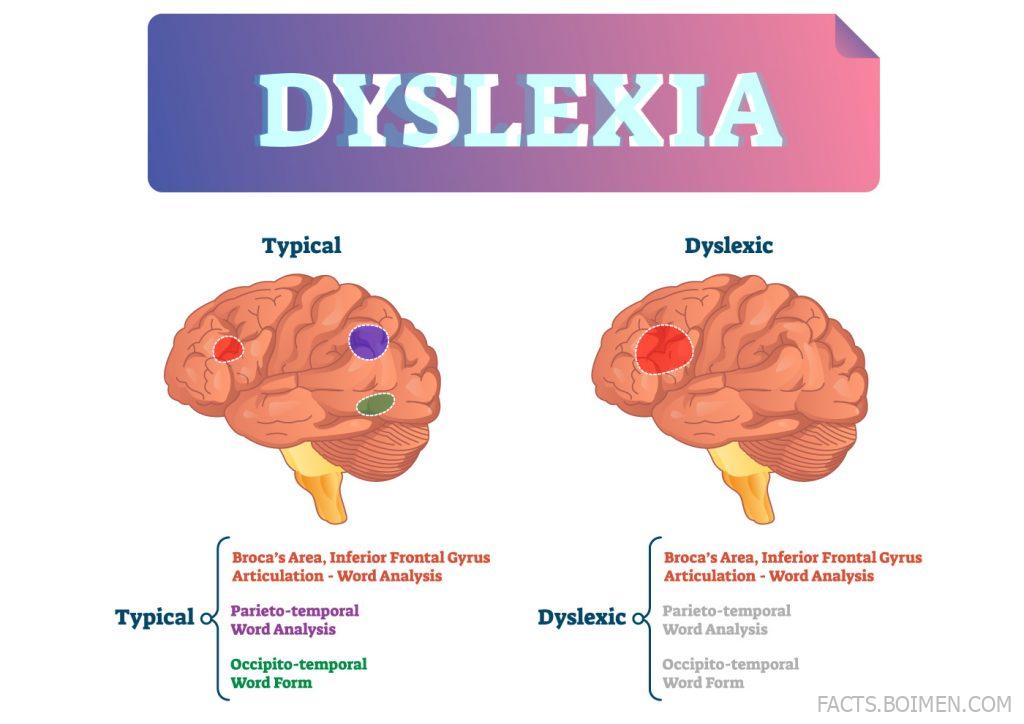
Dyslexia affects how the brain processes written language, and it has nothing to do with intelligence. It shows up in how letters are decoded, how words are tracked across a line, and how quickly a reader can lose their place. On screen, those difficulties get amplified by design choices that were never tested with dyslexic readers.
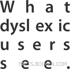
The most famous symptom is the “river effect”: when text is justified, the uneven gaps between words line up vertically and create white rivers running down the paragraph. For a dyslexic reader, those rivers pull the eye away from the words. It is not a metaphor. It is a real visual pattern that breaks reading flow, and it is one of the clearest examples of a design habit that hurts without anyone intending harm.
What makes all 21 practices below worth knowing is that they are invisible to most designers. They pass every visual review, every brand guideline, every aesthetic check. They fail only for the readers who need the most help. Fixing them is usually a matter of a few CSS values, a font swap, or a settings toggle.
21 Bad Practices That Hurt Dyslexic Users
1. Justified Text and the River Effect : The classic line-justification trap
What it is: Full justification stretches spaces so every line reaches both margins, creating uneven word gaps.
Category: Typography
Why it stands out:
- Creates vertical white “rivers” that pull the eye off the text
- Forces the brain to re-anchor at every line
- Worst in narrow columns where gaps grow largest
Best for: Switching to left-aligned text, which keeps word spacing consistent and eliminates rivers entirely.
2. Long Lines With No Measure Limit : Paragraphs that stretch across the screen
What it is: Body text that runs 120 characters or more per line on wide monitors.
Category: Layout
Why it stands out:
- Makes it easy to lose your place when returning to the next line
- Increases the chance of skipping or re-reading lines
- Common on blogs with full-width templates
Best for: Capping measure at 60-75 characters, which keeps line returns predictable.
3. Tight Line Height : Lines that crowd each other
What it is: Line height set at 1.2 or lower, squeezing rows of text together.
Category: Typography
Why it stands out:
- Descenders and ascenders nearly touch, blurring word shapes
- Makes tracking the current line harder
- WCAG recommends at least 1.5 for body text
Best for: Bumping line height to 1.5-1.8, which gives each line breathing room.
4. Decorative Display Fonts for Body Copy : Style over readability
What it is: Using script, condensed, or novelty fonts for paragraphs instead of headings.
Category: Typography
Why it stands out:
- Unusual letterforms slow down character recognition
- Similar-looking letters become harder to distinguish
- Often paired with thin weights that fade at small sizes
Best for: Keeping display fonts for headlines and using a plain sans-serif for body text.
5. All-Caps Paragraphs : Uniform letter shapes with no landmarks
What it is: Setting long passages in uppercase letters.
Category: Typography
Why it stands out:
- Removes word-shape cues that help fast recognition
- Reduces reading speed for most readers
- Feels like shouting even when it is not intended
Best for: Reserving all-caps for short labels and buttons only.
6. Italic Blocks of Text : Slanted letters that blur together
What it is: Long italic passages used for emphasis, quotes, or introductions.
Category: Typography
Why it stands out:
- Slanted strokes make letters harder to tell apart
- Slows reading more than bold does
- Often combined with light weights, compounding the issue
Best for: Using bold or color for emphasis and keeping italics to a word or two.
7. Low Contrast Gray-on-White Text : Light text that disappears
What it is: Body text in light gray (#999 or lighter) on a white background.
Category: Color and contrast
Why it stands out:
- Fails WCAG contrast minimums in many cases
- Becomes nearly invisible in bright rooms or on cheap screens
- Hurts readers with low vision alongside dyslexic users
Best for: Aiming for a contrast ratio of at least 4.5:1 for body text.
8. Pure Black on Pure White : Maximum contrast that glares
What it is: #000000 text on a #FFFFFF background.
Category: Color and contrast
Why it stands out:
- High brightness can cause visual stress and afterimages
- Many dyslexic readers prefer softer off-black on cream
- Glare increases on backlit screens at full brightness
Best for: Trying dark gray (#333) on off-white (#FAF9F6) as a gentler default.
9. Text Over Busy Background Images : Words fighting a photo
What it is: Placing paragraphs directly on top of photos or patterns.
Category: Layout
Why it stands out:
- Background detail competes with letter shapes
- Contrast changes from word to word
- Common in hero sections with no text scrim
Best for: Adding a solid or gradient overlay behind text, or moving copy off the image.
10. Centered Paragraphs : Ragged edges on both sides
What it is: Centering multi-line body text instead of only headlines.
Category: Layout
Why it stands out:
- Every line starts at a different point, removing a stable anchor
- Makes it harder to find the start of the next line
- Works fine for one-line captions, not paragraphs
Best for: Left-aligning anything longer than two lines.
11. Tiny Base Font Sizes : 12px body text on high-res screens
What it is: Setting body copy at 12px or smaller to fit more content.
Category: Typography
Why it stands out:
- Smaller letterforms reduce distinguishing details
- Forces zooming, which breaks layouts
- Particularly painful on phones held at arm’s length
Best for: A 16px minimum base size, scaling up on larger screens.
12. Letter Spacing Set Too Tight : Letters that merge
What it is: Negative or zero letter-spacing that packs characters together.
Category: Typography
Why it stands out:
- Letters like rn can read as m
- Reduces the whitespace that separates character shapes
- WCAG text spacing criteria call for adjustable spacing
Best for: Allowing slight positive tracking (around 0.01em) in body text.
13. Underlined Links Mixed Into Body Text : Visual noise inside sentences
What it is: Inline links styled with underlines that cut through descenders.
Category: Navigation
Why it stands out:
- Underlines add horizontal lines that disrupt word shapes
- Dense link clusters turn paragraphs into visual static
- Removing underlines entirely hurts link discovery
Best for: Using color plus a subtle underline offset (text-underline-offset) so lines clear the letters.
14. Wall-of-Text Layouts : No headings, no breaks
What it is: Pages with long unbroken paragraphs and few subheadings.
Category: Layout
Why it stands out:
- Removes the landmarks readers use to navigate
- Makes scanning nearly impossible
- Increases perceived effort before reading even starts
Best for: Adding subheads every few paragraphs and keeping paragraphs to 3-4 lines.
15. Auto-Playing Video and Motion : Movement that hijacks attention
What it is: Background video, animated banners, or looping GIFs that start on load.
Category: Motion
Why it stands out:
- Draws the eye away from text involuntarily
- Makes it hard to hold a reading position
- Distracting motion can be genuinely disorienting
Best for: Making media click-to-play and honoring reduced-motion preferences.
16. Timed Content and Countdowns : Reading against a clock
What it is: Carousels, session timeouts, and quizzes that advance on a timer.
Category: Interaction
Why it stands out:
- Dyslexic readers often need more time, not less
- Time pressure increases errors and anxiety
- Auto-advancing carousels move before reading finishes
Best for: Providing pause controls and letting users extend or disable timers.
17. Placeholder-Only Form Labels : Labels that vanish on focus
What it is: Using placeholder text as the only field label.
Category: Forms
Why it stands out:
- The label disappears the moment typing starts
- Forces users to remember what each field asked
- Low-contrast placeholder text is hard to read from the start
Best for: Keeping a persistent visible label above every input.
18. CAPTCHAs With No Audio Alternative : Distorted text as a gate
What it is: Image-based CAPTCHAs that require typing warped characters.
Category: Access
Why it stands out:
- Distorted letters are exactly what dyslexic readers struggle with
- Blocks access to forms, downloads, and accounts
- Refreshing repeatedly adds frustration, not security
Best for: Using checkbox or audio CAPTCHA alternatives that do not rely on decoding text.
19. Disabling Text Zoom on Mobile : Locked viewport settings
What it is: Setting maximum-scale or user-scalable=no in the viewport meta tag.
Category: Mobile
Why it stands out:
- Prevents pinch-zooming text to a comfortable size
- Locks out the simplest accessibility workaround
- Often added to fix layout bugs rather than help users
Best for: Removing zoom restrictions and letting text scale freely.
20. Hover-Only Navigation Menus : Menus that require precision
What it is: Dropdowns that open only on hover and close when the cursor slips.
Category: Navigation
Why it stands out:
- Requires steady pointer control to keep the menu open
- Invisible on touch devices without a tap fallback
- Sub-items vanish mid-reach, forcing a restart
Best for: Using click or tap to open menus, with generous hover tolerances if hover is kept.
21. No Dyslexia-Friendly Font Toggle : One setting that changes everything
What it is: Sites that offer no way to switch to a dyslexia-friendly typeface or reading mode.
Category: Personalization
Why it stands out:
- Fonts like OpenDyslexic add weight to letter bottoms, reducing flipping
- A single toggle can make an entire site comfortable
- Reader modes and extensions exist, but a built-in option is friendlier
Best for: Adding a simple font or reading-mode switch near the top of the page.
Bonus Mentions
OpenDyslexic : A free typeface built for dyslexic readers
What it is: An open-source font with weighted letter bottoms that reduce character flipping.
Category: Typeface
Why it stands out:
- Free to use on websites and in apps
- Distinct letter shapes improve recognition
- Pairs well with a user-facing font toggle
Best for: Designers who want an easy, credible accessibility option.
WCAG Quick Reference : The checklist behind most fixes here
What it is: The W3C’s filterable guide to accessibility success criteria.
Category: Reference
Why it stands out:
- Covers contrast, text spacing, timing, and zoom
- Filterable by level and technology
- Free and maintained by the W3C
Best for: Turning the fixes above into a documented audit.
WebAIM Contrast Checker : Test any color pair in seconds
What it is: A free tool that scores foreground and background colors against WCAG ratios.
Category: Tool
Why it stands out:
- Instant pass/fail for normal and large text
- Shows the exact ratio, not just a verdict
- No signup required
Best for: Checking gray-on-white body text before shipping.
MDN: text-underline-offset : The one-line fix for noisy links
What it is: Documentation for the CSS property that moves underlines away from letters.
Category: CSS
Why it stands out:
- Keeps link underlines from cutting through descenders
- Widely supported in modern browsers
- Takes one line of CSS to apply
Best for: Making inline links readable without removing underlines.
Nielsen Norman Group : Research on how people actually read
What it is: A research library on web usability and reading behavior.
Category: Research
Why it stands out:
- Evidence-based articles on scanning, line length, and forms
- Explains the why behind many fixes here
- Free articles with practical takeaways
Best for: Teams that want to justify accessibility changes with data.
Small Fixes, Big Relief
None of these 21 practices are exotic. They are the defaults most templates ship with: justified text, 1.2 line height, gray body copy, hover menus, and a viewport tag that blocks zoom. That is exactly why they matter. Dyslexic readers meet them on nearly every site, and each one adds a small tax to every paragraph.
The good news is that the fixes are cheap. Left-align your text and the river effect disappears. Raise line height to 1.5 and paragraphs breathe. Bump contrast and gray text becomes legible. Add a font toggle and readers can choose OpenDyslexic when they want it. Individually, each change is minor. Together, they turn a hostile page into a comfortable one.
If you are auditing a site, start with the three highest-impact items on this list: justification, line height, and contrast. They affect every reader, not just dyslexic ones, and they take an afternoon to correct. Then work down the list as time allows, testing with real users whenever you can.
Which of these bad practices have you spotted most often in the wild, and did you find a fix that worked? Share your own accessibility finds in the comments.