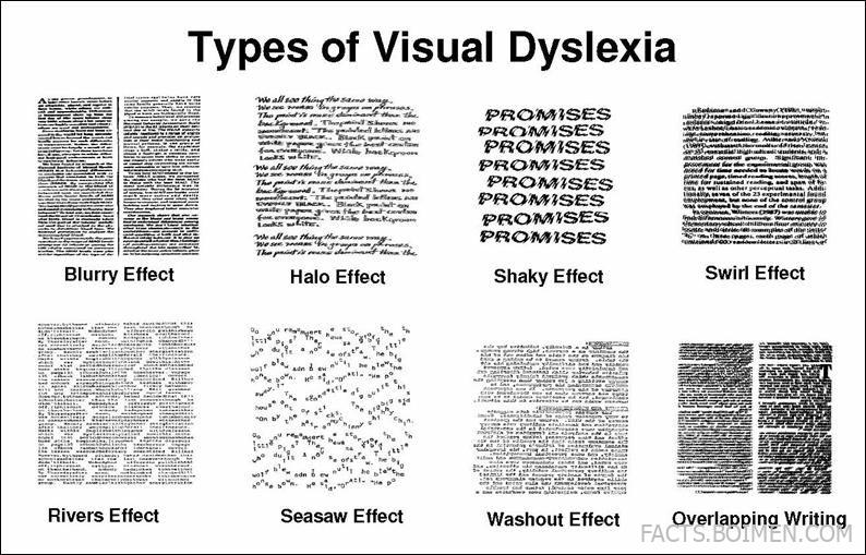
Imagine opening a book and watching the words melt, vibrate, or sprout glowing halos. For many people with visual dyslexia, that is not a metaphor — it is how text actually appears. Visual dyslexia (also called visual stress or Irlen syndrome) is a perceptual reading difficulty where the brain misprocesses what the eyes see, causing distortions that make reading exhausting and slow. The exact symptoms vary wildly from person to person, which is why researchers and advocacy groups have identified dozens of distinct visual effects. Below, we break down 20 of the most commonly reported types — from blurry and halo effects to rivers, washout, and overlapping writing. Each entry explains what it is, who it affects, and why it matters. Whether you are a parent, teacher, or someone who has always suspected your eyes play tricks on you, this list will help you put a name to the experience.
Table of Contents(Click to Toggle)
- Why Visual Dyslexia Types Matter
- The 20 Types of Visual Dyslexia
- 1. Blurry Effect
- 2. Halo Effect
- 3. Shaky Effect
- 4. Swirl Effect
- 5. Rivers Effect
- 6. Seesaw Effect
- 7. Washout Effect
- 8. Overlapping Writing
- 9. Double Vision (Diplopia)
- 10. Moving Text
- 11. Fading Text
- 12. Color Distortion
- 13. Depth Illusion
- 14. Pattern Glare
- 15. Tunnel Vision
- 16. Light Sensitivity (Photophobia)
- 17. Afterimage Effect
- 18. Shimmering Effect
- 19. Jumbled Letters
- 20. Word Crowding
- Bonus Mentions
- The Future of Visual Dyslexia Awareness
Why Visual Dyslexia Types Matter (And Why They’re Often Missed)
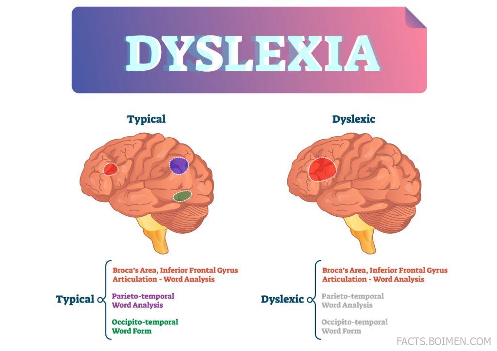
Most people think of dyslexia as a language-processing issue: swapping letters, struggling to sound out words. But visual dyslexia is different. It is a sensory-perceptual problem — the eyes send signals, but the brain misinterprets them, creating distortions that have nothing to do with phonics. According to the British Dyslexia Association, around 10% of the population shows some signs of visual stress, and many are never diagnosed because the symptoms are dismissed as “just needing glasses.”
Identifying the specific type matters because remedies are not one-size-fits-all. A person with the Washout Effect may benefit from colored overlays, while someone with the Rivers Effect often needs increased line spacing. Without precise language, sufferers feel isolated and teachers miss crucial accommodations. This list gives you that language. Share it with anyone who says reading makes them dizzy, tired, or nauseous — it might be the first time they feel understood.
The 20 Types of Visual Dyslexia
1. Blurry Effect : When text refuses to stay in focus
What it is: Words appear soft, fuzzy, or out of focus even when you have perfect vision. The blur may affect the whole page or just the edges of letters.
Category: Clarity distortion
Why it stands out: It is the most commonly reported visual dyslexia symptom, often mistaken for simple myopia. Unlike true blurriness, it fluctuates — the same word can be sharp one second and smudged the next. Many sufferers unconsciously squint or tilt their head to compensate, leading to headaches.
Best for: Recognizing when reading fatigue is neurological, not optical. A visit to a behavioral optometrist can rule out standard refractive errors.
2. Halo Effect : Glowing outlines around every letter
What it is: A bright, fuzzy aura appears around letters, as if each character is backlit. The halos can be white, colored, or shimmering.
Category: Light distortion
Why it stands out: It is especially common on high-contrast backgrounds (black text on white paper). The halos crowd the spaces between letters, making it hard to distinguish where one word ends and another begins. This effect often worsens under fluorescent lighting.
Best for: People who find white paper “too bright.” Switching to cream or gray paper can reduce halo intensity by up to 40% for some readers.
3. Shaky Effect : Words that tremble and vibrate
What it is: Text appears to jitter, shake, or vibrate slightly, as if viewed through a heat haze. The movement is involuntary and not caused by caffeine or anxiety.
Category: Motion distortion
Why it stands out: This type is frequently misdiagnosed as nystagmus or a neurological tremor. However, it disappears when the person closes one eye or uses a colored filter. It makes tracking lines nearly impossible, so reading speed drops dramatically.
Best for: Explaining why some students lose their place constantly. A simple reading ruler can anchor the text and reduce the shake.
4. Swirl Effect : Letters that spiral and twist
What it is: Individual letters or whole words appear to rotate, swirl, or curl inward. The distortion is dynamic — it changes as your eyes move across the page.
Category: Spatial distortion
Why it stands out: It is one of the most disorienting types, often causing motion sickness while reading. People with the Swirl Effect may avoid books entirely because the visual chaos triggers nausea. It is linked to poor binocular coordination.
Best for: Understanding why some readers need to close one eye to read comfortably. Vision therapy can sometimes retrain the eyes to work as a team.
5. Rivers Effect : White gaps that run through paragraphs like water
What it is: The white spaces between words align vertically, creating “rivers” of blank paper that flow down the page. These rivers distract the eye and break concentration.
Category: Layout distortion
Why it stands out: It is not a hallucination — it is a real perceptual phenomenon caused by justified text with wide word spacing. Most people can see rivers if they squint, but for visual dyslexics, the rivers are impossible to ignore.
Best for: Anyone who loses their place in dense paragraphs. Left-aligned text with generous spacing eliminates rivers almost entirely.
6. Seesaw Effect : Lines that tilt up and down
What it is: Sentences appear to slope, seesaw, or wave. A straight line of text may look like it is rising on one side and falling on the other.
Category: Orientation distortion
Why it stands out: It is often confused with astigmatism, but the seesaw effect persists even with corrected vision. It makes reading music notation or spreadsheets especially difficult because horizontal alignment is crucial.
Best for: People who constantly lose their place in tables or charts. Using a straight-edge guide under each line can stabilize the tilt.
7. Washout Effect : Text that fades into the background
What it is: Words become faint, washed out, or low-contrast, as if someone turned down the opacity. The text may look gray instead of black.
Category: Contrast distortion
Why it stands out: This type is frequently mistaken for eye fatigue or dry eye. However, it is neurological — the brain fails to maintain the contrast signal. It is particularly common in people with Meares-Irlen syndrome.
Best for: Readers who prefer dark mode or high-contrast settings. Colored overlays in blue or green can restore perceived contrast for some.
8. Overlapping Writing : Lines that crash into each other
What it is: Words from one line appear to overlap with words from the line above or below. The text looks like a double-exposed photograph.
Category: Spatial merging
Why it stands out: It is one of the most frustrating types because it makes reading comprehension nearly impossible. The brain tries to process two lines at once, leading to rapid mental exhaustion. It is often linked to poor saccadic eye movements.
Best for: Explaining why some people need huge line spacing. Increasing leading to 1.5 or double can separate the overlapping images.
9. Double Vision (Diplopia) : Seeing two of every word
What it is: Each word appears twice, either side-by-side or one above the other. The second image may be fainter or more transparent.
Category: Binocular vision distortion
Why it stands out: Unlike pathological diplopia, this type is intermittent and often triggered by fatigue. It is a classic sign of convergence insufficiency, where the eyes do not team properly. It affects up to 15% of schoolchildren.
Best for: Anyone who gets exhausted after 10 minutes of reading. Vision therapy exercises can dramatically improve convergence.
10. Moving Text : Words that slide across the page
What it is: Text appears to drift, slide, or scroll horizontally or vertically, even though the page is still.
Category: Motion distortion
Why it stands out: It is sometimes called “the scrolling effect.” The movement is smooth and continuous, making it feel like the book is a movie. It is often comorbid with vestibular disorders.
Best for: People who get motion sick from reading. Using an e-reader with a non-scrolling page-turn animation can help.
11. Fading Text : Words that disappear before you finish the sentence
What it is: The text gradually fades to white or gray, sometimes vanishing entirely until you blink or look away.
Category: Temporal distortion
Why it stands out: This is not a memory issue — the words are still on the page. It is a perceptual fading caused by the brain’s visual system adapting to the stimulus. It is more common when reading low-contrast text.
Best for: Understanding why some readers need to re-read the same line repeatedly. High-contrast fonts and frequent blinking breaks can reduce fading.
12. Color Distortion : Letters that change hue
What it is: Black text may appear to have colored fringes — red, blue, or green — especially at the edges of letters.
Category: Chromatic distortion
Why it stands out: It resembles chromatic aberration in cheap lenses, but it happens with normal vision. It is often a sign of visual stress that responds well to colored filters. The specific color that helps varies per person.
Best for: People who find black-on-white text “too harsh.” A colored overlay or tinted glasses can neutralize the fringes.
13. Depth Illusion : Words that float at different distances
What it is: Some words appear closer or farther away than others, as if the page has 3D depth. The text may look like it is popping out or sinking in.
Category: Depth perception distortion
Why it stands out: It is often accompanied by a feeling of disorientation. The brain struggles to fuse the images from both eyes, leading to a unstable sense of where the text actually is.
Best for: Explaining why some readers need to hold the book at a very specific distance. Prism glasses can sometimes correct the depth mismatch.
14. Pattern Glare : Text that sparkles with glare
What it is: A glare or sparkle appears over the text, as if the page is reflecting a bright light. It is especially noticeable on glossy paper or screens.
Category: Light sensitivity distortion
Why it stands out: It is distinct from ordinary glare because it happens even when there is no light source. The brain creates the sparkle. It is a hallmark of visual stress and is often relieved by colored filters.
Best for: Readers who prefer matte paper and anti-glare screens. A simple reading app with a sepia background can work wonders.
15. Tunnel Vision : Text that disappears at the edges
What it is: Only the words in the center of your gaze are clear; the rest of the page fades into a blur or disappears entirely.
Category: Visual field distortion
Why it stands out: It mimics the effect of looking through a straw. It is often a sign of visual processing inefficiency rather than a physical eye problem. It makes speed reading impossible.
Best for: People who need to use a finger or ruler to guide their eyes. Widening the visual field through therapy can help.
16. Light Sensitivity (Photophobia) : When the page itself feels too bright
What it is: The white background of a page or screen feels painfully bright, causing squinting, tearing, or headaches.
Category: Sensory sensitivity
Why it stands out: It is not a true phobia but a neurological hypersensitivity. It is extremely common in visual dyslexia and often co-occurs with migraines. It makes standard white paper almost unusable.
Best for: Anyone who reads better in dim light. Switching to dark mode or using a colored overlay can reduce symptoms immediately.
17. Afterimage Effect : Ghost words that linger
What it is: After looking away from a word, a faint negative image of it remains in your vision for several seconds.
Category: Retinal persistence distortion
Why it stands out: It is normal to see afterimages from bright lights, but visual dyslexics see them from ordinary text. The ghost images interfere with the next line, creating a palimpsest effect.
Best for: Explaining why some readers need to look away frequently. Reducing contrast and using a tinted overlay can shorten the afterimage duration.
18. Shimmering Effect : Words that glitter and sparkle
What it is: The text appears to shimmer, sparkle, or glitter, as if made of tiny lights. The effect is dynamic and distracting.
Category: Luminance distortion
Why it stands out: It is often mistaken for a migraine aura, but it happens without pain. It is linked to cortical hyperexcitability, where the brain’s visual cortex overreacts to patterns.
Best for: People who find reading overstimulating. Avoiding high-contrast patterns and using a filter can calm the shimmer.
19. Jumbled Letters : Letters that swap places within a word
What it is: The letters within a word appear to rearrange themselves — “was” becomes “saw,” “on” becomes “no.”
Category: Sequencing distortion
Why it stands out: This is the classic stereotype of dyslexia, but it is actually a visual sequencing problem, not a language one. It is often accompanied by letter reversals (b/d, p/q).
Best for: Understanding why some readers guess words based on shape. Multisensory reading programs that use touch and sound can help.
20. Word Crowding : Letters that merge into a single blob
What it is: Adjacent letters and words appear to crowd together, losing their individual identity. The text looks like a continuous string of shapes.
Category: Spacing distortion
Why it stands out: It is one of the most well-researched types, linked to a deficit in visual attention. It is why many dyslexics read better with extra letter spacing. It is not a vision problem — it is a processing bottleneck.
Best for: Anyone who benefits from large-print books. Increasing letter spacing by just 2-3 points can improve reading speed significantly.
Bonus Mentions
Visual Stress : The umbrella term for all these effects
What it is: A general term for the discomfort and distortion caused by visual stimuli. It encompasses all 20 types above and is often used interchangeably with Meares-Irlen syndrome.
Category: Clinical category
Why it stands out: It is the diagnosis you will see on official reports. Knowing the term helps you find research and support groups.
Best for: Parents seeking school accommodations. A formal visual stress diagnosis can qualify a child for colored overlays and extra time on tests.
Scotopic Sensitivity Syndrome : The original name for visual dyslexia
What it is: An older term coined by Olive Meares and Helen Irlen in the 1980s. It describes a sensitivity to light and color that affects reading.
Category: Historical term
Why it stands out: It is still used in some academic circles. Understanding the history helps you evaluate older research and see how the field has evolved.
Best for: Researchers and curious readers who want to trace the roots of visual dyslexia awareness.
Meares-Irlen Syndrome : The most common clinical label
What it is: A specific condition characterized by visual perceptual distortions and light sensitivity, named after the two researchers who identified it.
Category: Clinical diagnosis
Why it stands out: It is the term most likely to be recognized by optometrists and educational psychologists. It is distinct from dyslexia but frequently co-occurs.
Best for: Getting a formal assessment. A certified Irlen diagnostician can prescribe precise colored filters.
Colored Overlay Test : The first step to relief
What it is: A simple screening tool where you place different colored plastic sheets over text to see which one reduces distortion.
Category: Assessment tool
Why it stands out: It is non-invasive, inexpensive, and can be done at home. Many people find immediate relief with the right color. It is not a cure, but it is a powerful accommodation.
Best for: Anyone who wants to experiment before committing to tinted glasses. You can buy a set of overlays online for under $20.
Irlen Method : A formal tinting system
What it is: A proprietary method of prescribing colored filters, both as overlays and as precision-tinted glasses, based on individual assessment.
Category: Treatment approach
Why it stands out: It is the most widely known intervention for visual dyslexia. It has helped thousands, though it is not universally accepted by all vision scientists. It requires a trained Irlen diagnostician.
Best for: People who have tried generic overlays and want a more precise solution. The assessment takes about two hours.
The Future of Visual Dyslexia Awareness
Visual dyslexia is not a single condition — it is a spectrum of perceptual quirks that can make reading feel like a battle. The 20 types above are not official diagnostic categories, but they are real experiences reported by thousands of people. By naming them, we can start conversations with teachers, employers, and eye doctors that lead to practical help: a colored overlay, a different font, extra time, or simply understanding.
If any of these descriptions felt familiar, you are not imagining it. Your brain is simply wired to see text differently. The next step is to find a behavioral optometrist or Irlen diagnostician who can assess your specific pattern. And if you have discovered your own type of visual distortion that is not on this list, we would love to hear it — what does reading look like for you? Share your experience in the comments and help expand this map for someone else.