Most people read a sentence like this one without noticing the machinery behind it: the eyes lock onto letters, the brain maps shapes to sounds, and meaning arrives almost instantly. For roughly one in ten readers, that machinery runs on a different route. Letters swap places, words blur at the edges, and a paragraph that looks simple can take three times the effort. The pin that brought you here asked a simple question: what is it actually like to be dyslexic? Rather than explain it, the tools below let you feel it for a few minutes. Each one is a real, working simulator, typeface, or interactive demo built by educators, designers, and accessibility researchers.
Table of Contents(Click to Toggle)
- Why Reading a Dyslexia Simulator Changes How You See Text
- 21 Tools That Show How It Feels to Be Dyslexic
- 1. Dsxyliea
- 2. Dyslexia Simulation by Understood
- 3. OpenDyslexic
- 4. Lexend
- 5. Atkinson Hyperlegible
- 6. Dyslexic Font by Christian Boer
- 7. BeeLine Reader
- 8. Immersive Reader
- 9. Helperbird
- 10. Read&Write by Texthelp
- 11. Voice Dream Reader
- 12. Speechify
- 13. NaturalReader
- 14. Learning Ally
- 15. Bookshare
- 16. Project Gutenberg
- 17. LibriVox
- 18. Dyslexia-friendly Wikipedia skin
- 19. Tint & Overlay color tools
- 20. Readline screen ruler tools
- 21. Web Content Accessibility Guidelines (WCAG)
- Bonus Mentions
- The Quiet Power of Trying Someone Else’s Eyes
Why Reading a Dyslexia Simulator Changes How You See Text
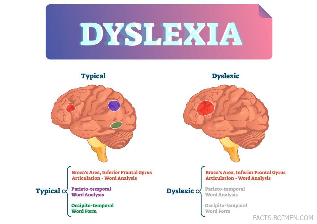
Dyslexia is not a vision problem and it is not a measure of intelligence. It is a difference in how the brain processes written language, and it shows up in decoding speed, spelling, and the exhausting work of holding a sentence together long enough to understand it. That is exactly why simulators matter. A paragraph of statistics slides off the memory; a paragraph that scrambles as you read it does not. The demos below fall into a few families: jumbled-text simulators that recreate the reading experience, typefaces designed to reduce letter confusion, reading rulers and overlays that tame visual stress, and text-to-speech tools that let the ears carry the load. Try a couple in order, and note how quickly your patience drains. That fatigue is the part most people never see.
21 Tools That Show How It Feels to Be Dyslexic
1. Dsxyliea : The scrambled-text simulator that started this whole rabbit hole
What it is: A single-page web toy that re-renders a short story so letters inside each word shift and swap as your cursor moves across the text.
Category: Reading simulation.
Why it stands out: It is deliberately minimal, loads instantly, and needs no account. The effect is subtle at first, then relentless: your eyes keep re-reading the same line because the shapes refuse to stay put. It is the closest thing to a five-second empathy switch.
Best for: Teachers, parents, and anyone who has ever said “just read it again more slowly.”
2. Dyslexia Simulation by Understood : A guided, narrated walkthrough of a dyslexic reading load
What it is: Understood, a nonprofit focused on learning differences, hosts interactive simulations and first-person accounts that walk you through decoding, spelling, and classroom scenarios.
Category: Guided simulation and education.
Why it stands out: Instead of a single gimmick, it layers context: what the reader sees, what the teacher sees, and what the student feels. The written reflections from real students are the part that lingers.
Best for: Parents preparing for a school meeting or an IEP conversation.
3. OpenDyslexic : A free typeface with weighted letter bottoms to fight flipping
What it is: An open-source font family designed so each letter has a heavier base, which helps anchor characters that are easy to mirror or rotate.
Category: Accessible typeface.
Why it stands out: It is genuinely free for personal and commercial use, and browser extensions plus e-readers support it directly. Note that research on reading speed is mixed; many readers love it, others find it slower, which is itself a useful lesson in how individual the experience is.
Best for: Readers who lose their place on b, d, p, and q.
4. Lexend : A font family tuned for reading fluency, not decoration
What it is: A variable font developed from reading-proficiency research, with generous spacing and simplified letterforms.
Category: Accessible typeface.
Why it stands out: Lexend ships in several widths and weights, so you can dial spacing up without switching typefaces. It is also bundled into Google Fonts, which means you can drop it into a website in about thirty seconds.
Best for: Designers and teachers building worksheets or reading apps.
5. Atkinson Hyperlegible : Letterforms built for maximum distinguishability
What it is: A free font from the Braille Institute that deliberately redesigns commonly confused characters so each one is unmistakable.
Category: Accessible typeface.
Why it stands out: It was created for low vision rather than dyslexia specifically, but the goal overlaps: stop I, l, and 1 from looking like relatives. The Institute offers it free with no licensing hoops.
Best for: Signs, forms, and interfaces where a misread character is costly.
6. Dyslexic Font by Christian Boer : The original dyslexia-specific typeface experiment
What it is: A font created by designer Christian Boer, who is dyslexic himself, with slanted openings and heavier strokes to reduce rotation errors.
Category: Accessible typeface.
Why it stands out: It is one of the earliest and most widely discussed attempts to design letters around dyslexia, and the project site explains the design reasoning letter by letter. Independent studies have found mixed results on speed, so treat it as one option in a toolkit.
Best for: Anyone curious about the design theory behind dyslexia-friendly typography.
7. BeeLine Reader : Color gradients that pull your eyes down the page
What it is: A tool that applies a subtle color gradient across each line of text, guiding the eye from the end of one line to the start of the next.
Category: Reading aid.
Why it stands out: Line-skipping is one of the most common reading complaints, and BeeLine attacks it directly without changing the words. There is a browser extension and a PDF mode, and the effect is visible within seconds.
Best for: Long articles, PDFs, and anyone who rereads the same line twice.
8. Immersive Reader : Microsoft’s free read-aloud and focus toolkit
What it is: A built-in reading mode across Microsoft Edge, Word, OneNote, and Teams that reads text aloud, highlights words, and lets you adjust spacing and line focus.
Category: Reading and accessibility suite.
Why it stands out: It is already installed on millions of machines, which makes it the lowest-friction option on this list. The line-focus mode dims everything except a few lines, which quietly removes a huge amount of visual noise.
Best for: Students and office workers who want help without installing anything new.
9. Helperbird : A browser toolbar that reshapes any web page
What it is: An accessibility extension for Chrome and Edge that adds dyslexia-friendly fonts, overlays, text-to-speech, and reading rulers to any site.
Category: Browser extension.
Why it stands out: It bundles a dozen small fixes into one switchboard, so you can test which combination actually helps you rather than guessing. Some features sit behind a paid tier, but the free set covers fonts, spacing, and the ruler.
Best for: People who want one extension instead of five.
10. Read&Write by Texthelp : The classroom workhorse for reading and writing support
What it is: A literacy toolbar with text-to-speech, word prediction, screenshot reading, and vocabulary support, widely deployed in schools.
Category: Literacy support software.
Why it stands out: It handles the whole loop, not just reading: it can read a PDF aloud, predict the word you are stuck on, and pull up a picture dictionary. Schools often hold licenses, so it is worth asking before buying.
Best for: Students writing essays who need help both decoding and composing.
11. Voice Dream Reader : A customizable text-to-speech reader for phones
What it is: A mobile app that reads documents, ebooks, and web articles aloud with fine control over voice, speed, and visual highlighting.
Category: Text-to-speech app.
Why it stands out: The customization is the point: you can sync a highlighted word with the spoken voice, adjust the font, and set the reading pace to something that actually matches your comprehension. It is a paid app, and the depth of settings justifies the price for heavy readers.
Best for: Commuters and students who read with their ears.
12. Speechify : Turn any article, PDF, or email into audio
What it is: A text-to-speech service with browser and mobile apps that can read documents, web pages, and even scanned images aloud.
Category: Text-to-speech app.
Why it stands out: The OCR feature is the standout: photograph a printed page and it will read it back. Voice quality is high, and the speed range goes well past normal listening rates for people who process faster by ear.
Best for: Anyone with a stack of scanned handouts or PDFs.
13. NaturalReader : A long-running online reader with a generous free tier
What it is: A web and desktop tool that converts text, PDFs, and ebooks into spoken audio with a drag-and-drop interface.
Category: Text-to-speech app.
Why it stands out: It has been around long enough to be dependable, and the free tier covers everyday reading without a credit card. The desktop version can float over other windows, which makes it useful for reading along with anything on screen.
Best for: Trying text-to-speech for the first time without commitment.
14. Learning Ally : Human-narrated audiobooks for students who struggle with print
What it is: A nonprofit audiobook library built specifically for readers with learning differences, including dyslexia.
Category: Audiobook library.
Why it stands out: The narrations are human rather than synthetic, and the catalog is organized around school reading lists, so a student can follow the same book the class is reading. Membership is typically arranged through a school or purchased individually.
Best for: Students who need to keep pace with assigned reading.
15. Bookshare : A massive accessible ebook library for qualifying readers
What it is: A nonprofit digital library offering hundreds of thousands of accessible titles in formats that work with screen readers and text-to-speech tools.
Category: Accessible ebook library.
Why it stands out: Eligibility covers people with documented reading disabilities such as dyslexia, and membership is free for qualifying US students. It is one of the few places where the accessible version of a textbook exists at all.
Best for: Readers who need books in formats built for assistive tech.
16. Project Gutenberg : Free classic texts you can reformat however you need
What it is: A volunteer-run library of tens of thousands of public-domain books available as plain text, EPUB, and HTML.
Category: Free ebook library.
Why it stands out: Plain text is the ultimate accessibility format: you can paste it into any reader, change the font, increase spacing, or run it through text-to-speech. No DRM, no app required, no account.
Best for: Readers who want full control over how text is displayed.
17. LibriVox : Free public-domain audiobooks read by volunteers
What it is: A volunteer project that records public-domain books and releases every recording into the public domain.
Category: Free audiobook library.
Why it stands out: The catalog is enormous and completely free, and because the recordings are public domain you can download, remix, or re-share them. Narration quality varies by volunteer, which is part of the charm and worth sampling before a long listen.
Best for: Readers who want audiobooks without a subscription.
18. Dyslexia-friendly Wikipedia skin : Reshape one of the web’s biggest reading sites
What it is: Wikipedia supports user styles and preferences that let readers change fonts, spacing, and layout, and its accessibility project documents the options.
Category: Site customization.
Why it stands out: Wikipedia is where a lot of reading happens, and a small CSS tweak, larger line height, wider letter spacing, a dyslexia-friendly font, transforms it. The accessibility pages explain the reasoning behind each recommendation.
Best for: Tinkerers who want a calmer reading experience on a site they already use.
19. Tint & Overlay color tools : Warm the screen and dim the glare
What it is: Iris and similar tools apply color temperature, tint, and overlay filters across your entire screen or specific apps.
Category: Visual comfort tool.
Why it stands out: Visual stress, where high-contrast black text on bright white seems to vibrate, is a common companion complaint to reading difficulty. A colored overlay or a warmer tint reduces that glare, and the effect is immediate and reversible. Some people find colored filters do nothing, which is normal and worth knowing.
Best for: Readers who get headaches or eye strain from bright screens.
20. Readline screen ruler tools : A physical-style guide rail for digital text
What it is: A screen ruler that sits over your display and highlights a single strip of text at a time, mimicking the reading guides used with paper books.
Category: Reading aid.
Why it stands out: It is a direct translation of a low-tech classroom tool into software. The highlighted band keeps your eye from wandering to the next line, and it works over PDFs, spreadsheets, and web pages alike.
Best for: Anyone who loses their place on dense pages of text.
21. Web Content Accessibility Guidelines (WCAG) : The standard behind every fix on this list
What it is: The international guidelines from the W3C that define how to make web content usable for people with disabilities, including reading differences.
Category: Accessibility standard.
Why it stands out: Every tool above is a workaround for a page that ignored these rules. WCAG covers text resizing, contrast, spacing, and alternatives to text, and it is the reference designers cite when they argue for a more readable web. Reading it once changes how you see every site afterward.
Best for: Designers, developers, and anyone who publishes content online.
Bonus Mentions
LD OnLine : A long-standing hub for learning-difference information
What it is: A nonprofit information site with articles, expert Q&As, and resources on learning disabilities.
Category: Information resource.
Why it stands out: It has been maintained for decades and its material is written for parents and teachers rather than researchers, which makes it unusually practical.
Best for: A first stop after a diagnosis or a suspicion.
International Dyslexia Association : Fact sheets and a structured literacy framework
What it is: A nonprofit organization offering fact sheets, a provider directory, and information on structured literacy approaches.
Category: Advocacy and education.
Why it stands out: The fact sheets are short, citable, and free, which makes them useful ammunition in school meetings where you need a credible source.
Best for: Parents and educators advocating for support.
British Dyslexia Association : Style guides and workplace guidance
What it is: A UK charity publishing dyslexia-friendly style guides, screening information, and workplace resources.
Category: Advocacy and education.
Why it stands out: Its dyslexia-friendly style guide is one of the most concrete documents of its kind, with specific advice on fonts, spacing, and document layout that anyone can apply today.
Best for: Anyone producing documents, slides, or web pages.
Dyslexic Advantage : A strengths-first look at how dyslexic minds work
What it is: A nonprofit that publishes articles and research summaries focused on the cognitive strengths associated with dyslexia.
Category: Community and research.
Why it stands out: After a list of struggle simulators, it is worth ending on the other side of the coin: the spatial reasoning, narrative thinking, and big-picture pattern recognition that many dyslexic readers bring to their work.
Best for: Readers who want the whole picture, not just the difficulty.
ADDitude Magazine : Practical coping strategies for related reading challenges
What it is: A publication covering attention and learning differences with tool reviews and everyday strategy guides.
Category: Information resource.
Why it stands out: Dyslexia often travels with attention differences, and this site covers the overlap with concrete, non-judgmental advice rather than clinical jargon.
Best for: Readers juggling more than one learning difference.
The Quiet Power of Trying Someone Else’s Eyes
None of these tools is a cure, and none of them is a complete picture of what dyslexia feels like. A simulator scrambles letters for a minute; a real reader lives with that scramble every day, and still finishes the chapter, still takes the notes, still shows up. What the list above offers is a small, honest dose of perspective, plus a genuinely useful set of fixes. If you only try two things, make it the scrambled-text demo at the top and a text-to-speech reader: one shows you the problem, the other shows you how capable the workaround can be. The rest are there for whenever you want to go further, whether you are a teacher building a worksheet, a designer choosing a font, or a reader looking for a way to make the page behave.
Which of these did you end up trying first, and did any of them surprise you? If you have found a hidden gem of your own, drop it in the comments so the next reader can find it too.