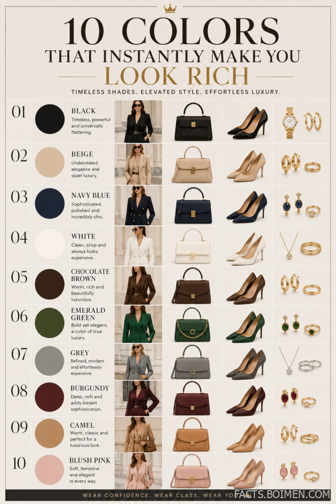
Ever notice how some people just look expensive — even in a simple tee and jeans? It’s not the label on the inside. It’s the color on the outside. The right palette can instantly elevate your presence, making you look polished, put-together, and quietly wealthy. This list breaks down the exact shades that scream ‘old money’ without screaming at all.
Table of Contents(Click to Toggle)
Why Color Matters for Looking Rich
Color psychology in fashion is real. Certain hues have been associated with wealth, authority, and refinement for centuries — think royal purple, navy for naval officers, and camel for luxury houses like Burberry. When you wear these colors, you borrow their cultural weight. You signal taste, confidence, and an understanding of subtle elegance. It’s not about spending more; it’s about choosing smarter. These 10 shades form the foundation of a quiet luxury capsule — versatile, timeless, and flattering on every skin tone.
The 10 Shades That Instantly Elevate Your Style
1. Black : The ultimate power neutral
What it is: The classic, non-negotiable shade of sophistication.
Category: Neutral
Why it stands out: Black flatters every figure, hides stains, and instantly sharpens any outfit. It’s the backbone of a capsule wardrobe — think black blazers, tailored trousers, and slip dresses. Unlike harsh charcoal, pure black creates a strong silhouette that photographs beautifully and never looks dated.
Best for: Evening events, job interviews, and creating a sleek, minimalist look.
2. Beige : Effortless warmth and versatility
What it is: A soft, sandy neutral that mimics natural fibers like linen and cashmere.
Category: Neutral
Why it stands out: Beige is the color of quiet luxury — think of old money families in the Hamptons. It pairs beautifully with white, camel, and brown, creating a monochromatic look that feels expensive. It’s also a great base for layering textures, like a chunky knit over a silk skirt.
Best for: Daytime outings, resort wear, and building a cohesive neutral wardrobe.
3. Navy Blue : Sophisticated and timeless
What it is: A deep, dark blue that reads as formal yet approachable.
Category: Dark neutral
Why it stands out: Navy is the color of naval officers and Ivy League blazers. It’s a safe alternative to black that adds depth without being harsh. A navy suit or dress instantly communicates competence and trustworthiness. It also complements a wide range of skin tones, making it a universal choice.
Best for: Business settings, formal events, and creating a classic preppy look.
4. White : Clean, crisp, and always fresh
What it is: The purest shade, often seen in crisp shirts and summer dresses.
Category: Neutral
Why it stands out: White is the color of cleanliness and simplicity. A white button-down or tailored trousers instantly elevate any outfit. It reflects light, making you appear more awake and polished. In summer, white linen pieces look effortlessly expensive — think Mediterranean vacations.
Best for: Summer, professional settings, and creating a fresh, minimal aesthetic.
5. Chocolate Brown : Deep, rich, and luxurious
What it is: A dark, warm brown that resembles cocoa or espresso.
Category: Earth tone
Why it stands out: Chocolate brown is having a major moment in quiet luxury fashion. It feels grounded and opulent — think leather jackets, cashmere sweaters, and suede boots. It pairs beautifully with cream, camel, and even burgundy. This shade adds warmth to your wardrobe without being flashy.
Best for: Fall and winter, adding depth to neutral outfits, and creating a cozy yet polished look.
6. Emerald Green : Jewel-toned elegance
What it is: A rich, vibrant green reminiscent of precious gemstones.
Category: Jewel tone
Why it stands out: Emerald green is a statement of luxury without being loud. It’s the color of velvet sofas and royal jewels. A silk blouse or tailored dress in emerald instantly makes you look like you’re wearing something expensive. It flatters all skin tones, especially those with warm undertones.
Best for: Holiday parties, evening wear, and adding a pop of color to a neutral wardrobe.
7. Grey : Refined, modern, and effortlessly expensive
What it is: A versatile neutral that ranges from light silver to charcoal.
Category: Neutral
Why it stands out: Grey is the color of tailored suits and cashmere sweaters. It’s understated yet sophisticated, making it a favorite among minimalists. Light grey reads as modern and airy, while charcoal adds a touch of drama. Grey pairs well with almost everything, making it a smart investment.
Best for: Office wear, minimalist wardrobes, and creating a monochromatic look.
8. Burgundy : Deep sophistication with a hint of drama
What it is: A dark red with purple undertones, like red wine.
Category: Jewel tone
Why it stands out: Burgundy is the color of luxury and drama. It’s a richer alternative to red that feels more refined. A burgundy sweater or handbag adds depth to neutral outfits. It’s particularly striking in fall and winter, evoking images of leather-bound books and mahogany.
Best for: Fall layering, evening events, and adding a touch of warmth.
9. Camel : The epitome of quiet luxury
What it is: A light brown with golden undertones, like the animal it’s named after.
Category: Earth tone
Why it stands out: Camel is the color of classic luxury — think of Burberry trenches and Hermès bags. It’s warm, inviting, and timeless. A camel coat instantly elevates any outfit, making it look more expensive. It pairs beautifully with black, white, and denim.
Best for: Outerwear, accessories, and creating a polished, classic look.
10. Ivory : Soft, creamy, and refined
What it is: A warm off-white with a hint of cream.
Category: Neutral
Why it stands out: Ivory is softer and more flattering than pure white, especially for those with warm skin tones. It’s the color of silk blouses, cashmere turtlenecks, and wedding dresses. Ivory adds a touch of elegance and femininity without being stark.
Best for: Romantic looks, winter wear, and creating a soft, sophisticated palette.
Bonus: Blush Pink : Subtle femininity
What it is: A muted, dusty pink that’s more sophisticated than bright pink.
Why it stands out: Blush pink adds a soft touch of color that feels modern and chic. It’s a great alternative to beige for those who want a hint of warmth.
Bonus: Olive Green : Earthy and grounded
What it is: A muted green with brown undertones, like military uniforms.
Why it stands out: Olive green is practical yet stylish, often seen in utility jackets and cargo pants. It adds an edge to neutral outfits.
Bonus: Lavender : Unexpected elegance
What it is: A pale purple with a calming effect.
Why it stands out: Lavender is a fresh take on pastels, adding a touch of whimsy while still looking refined.
Your Rich Color Wardrobe Awaits
Building a wardrobe that looks expensive isn’t about price tags — it’s about choosing colors that project confidence and timelessness. These 10 shades (plus a few bonus picks) are the secret weapons of quiet luxury. Start by incorporating one or two into your rotation, and you’ll notice the difference in how you feel — and how others perceive you.
What color do you think makes you look the most expensive? Share your go-to shade in the comments below!